Dashboard
After logging in the application starts, by default, in the GEM Dashboard. Here you will find data regarding past alerts and GEM use.
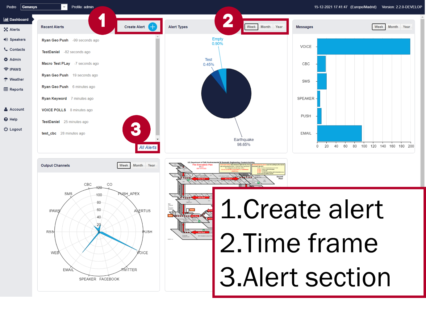
The Dashboard is split into 5 sections:
Last Alerts – shows the names of the most recently launched alerts and how long ago they were launched.
Alert Types – This pie chart shows the distribution of different types of emergencies for which alerts are launched.
Messages – A horizontal bar chart showing the total number of messages sent to contacts by each communication channel.
Incidents – This bar chart shows the number of incidents created.
Output Channels – This radar chart shows the distribution of use for different communication channels.
Each one of these sections can be set to display data for the past week, month, or year as indicated in the figure above. GEM administrators can configure the Dashboard so that each client only sees the charts and information that is relevant to them.